Mid-Century
Mid-Century virtual staging
Of the eight, this is the one with a genuine claim to being native. The post-war ranch, the split-level and the tract modern house are American housing stock built in the decades this furniture was designed in, and putting the two together looks like the room got its own furniture back.
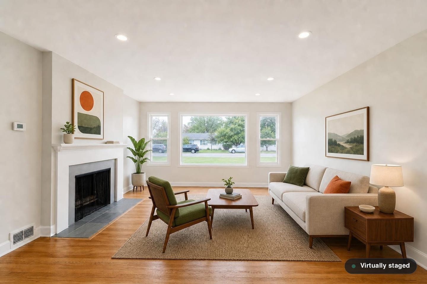
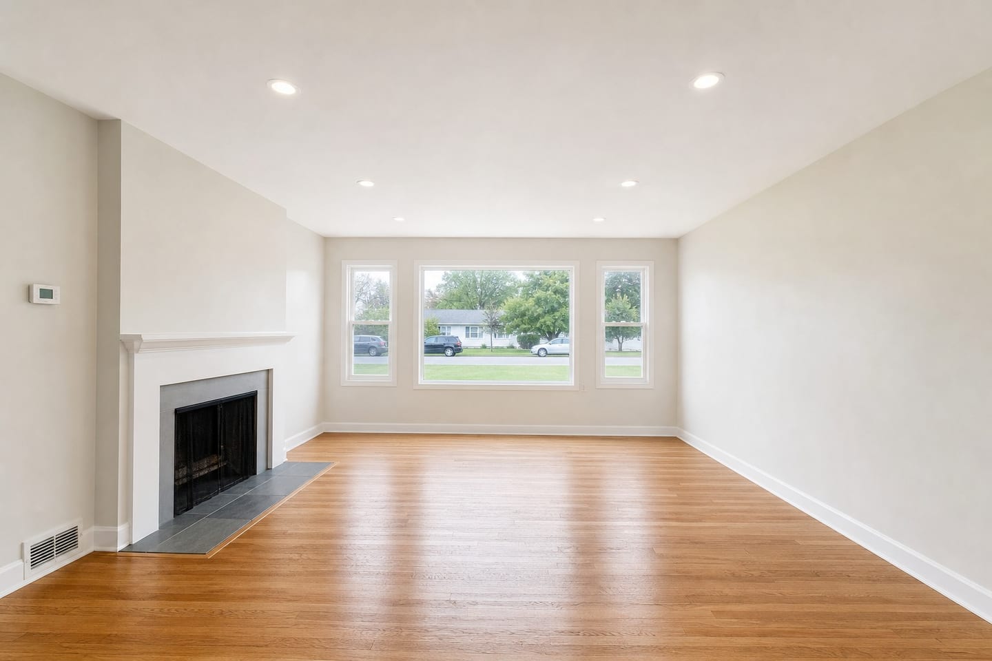 BeforeAfter
Contemporary with the building
Walnut and teak tones, tapered legs, clean upholstery lines and usually one saturated accent — a green cushion, a rust pillow, a single strong piece of art. It photographs warmer than Scandinavian and with more energy than Japandi while keeping the same lightness, because furniture raised on slim legs shows floor underneath and floor is what makes a room read as large as it is.
The reason it works so often here is chronological rather than aesthetic. Tens of millions of American houses were built between 1945 and 1970, and in one of those the furniture is not a look applied to the room — it is roughly what the room was drawn for.
The listings it fits
Ranches, split-levels, raised ranches, tract modern houses, and anything with a low-pitched roof, a picture window or clerestory glazing. It suits a front living room particularly well, which is exactly the room in post-war stock that a buyer cannot assign a purpose to when it is empty.
It is also the scheme to reach for when a listing has to stand out in a street of near-identical houses. The accent color gives the lead interior photograph something a buyer can remember it by, without the room looking decorated.
Where it costs you
In a very small room the low tables and side pieces start reading as obstacles rather than furniture, and Scandinavian's simpler arrangement photographs cleaner. In new construction with an open plan and no era of its own, it can look like an era has been imposed on a house that never had one.
The other risk is enthusiasm. Done heavily this becomes a period set rather than a home, and a buyer is supposed to be picturing their own furniture in the room rather than admiring ours.
Where to spend it across a set
The front living room, every time. This scheme wants a sofa, a lounge chair, a low table and one accent piece arranged in a room with a picture window and a plain fireplace, which describes the front of an extraordinary number of American houses.
It carries a dining room well too, where a walnut table and chairs read as a considered choice rather than as rental furniture. It also holds a knocked-through living-dining space together, because a consistent timber tone ties two zones without either needing a scheme of its own.
It is weaker in bedrooms, where the low case pieces stop earning their floor area, and in anything under about eleven by eleven. Use it where the arrangement has room to breathe.
Mid-Century questions
- Is this only for actual mid-century houses?
- No, but that is where it is strongest. In a colonial or a traditional two-story it works in a den or a family room; in a formal front room with millwork, Classic Traditional generally sits better with the house.
- How predictable is the accent color?
- Roughly. Expect one saturated piece per room rather than a coordinated scheme. If the accent fights something real in the room, restyle that photo and render it again.
- Does it suit new construction?
- Reasonably, though a house with no period reference of its own often photographs better in Scandinavian or Japandi, which do not imply an era the building does not have.
Try Mid-Century on your room
One free render on your own photo, with the untouched original delivered beside it.
Stage a room freeGeneral guidance about how furnishing schemes photograph in US housing stock, and about how the software behaves. Not legal advice, and not a statement of what your state commission, your MLS or your broker requires of a listing image — confirm those before a staged photo is published.