Coastal
Coastal virtual staging
Two kinds of listing use this scheme heavily and for different reasons: shoreline resale, where it agrees with the reason somebody is looking at all, and vacation rental, where atmosphere is most of the product. Everywhere else it is the easiest of the eight to get visibly wrong.
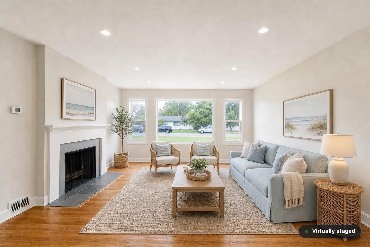
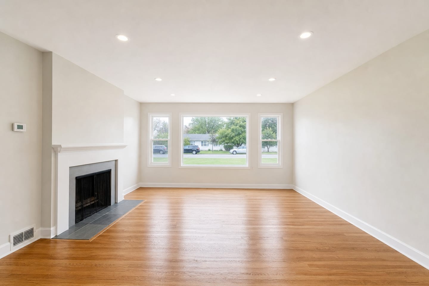 BeforeAfter
It answers a question the buyer already asked
Cane and rattan, slipcovered upholstery, bleached oak, soft blue-green and sand tones, and very little contrast anywhere. Every other scheme in this set is mostly arguing about scale — how big is this room, what fits in it. This one is not. Somebody who has filtered a search down to a Gulf-front building, or to a lake within two hours of Atlanta, has already decided what they want, and the furniture's job is to agree with them rather than to measure anything.
That makes it unusually efficient inside its range and close to useless outside it, because there is no scale argument left to fall back on when the location does not support the palette.
The listings it fits
Beach and barrier-island resale on the Gulf, Atlantic and Pacific; lake and reservoir markets across the Southeast and the upper Midwest; snowbird condo inventory; and vacation-rental sets that compete on how a week there would feel rather than on bedroom count.
It also holds up under hard afternoon light, which matters in exactly the markets where it belongs. A scheme built on deep tones goes muddy in a room with pale tile and glare coming off the water; this one does not.
Three ways it goes wrong here
The first is geography, and it is the obvious one. Inland, the palette reads as a theme somebody picked rather than as anything about the property, and it registers before the room does. The example on this page is deliberately that failure: shore prints on the wall of a ranch whose picture window looks onto a suburban street.
The second is saturation, and it is specific to this market. In parts of coastal Florida and the Carolinas something close to every staged condo listing is furnished in some version of this, so the scheme meant to confirm the proposition stops distinguishing your unit from the eleven others in the same tower. Where that is true, a restrained Japandi or Scandinavian treatment reads as more considered and is far more likely to survive a scroll through a search grid.
The third is conveyance, and it is the one to be careful about. A good deal of shoreline and seasonal inventory changes hands furnished, and in those markets a buyer looking at a set of soft, fully-furnished-looking rooms may reasonably take the furniture to be part of the deal. It is not — none of it exists. Where furnished sales are ordinary, the disclosure should say outright that the furnishings are virtual and not included, rather than leaving the buyer to infer it.
Where to spend it across a set
The rooms the water is actually in. That is the entire mechanism — the scheme works by agreeing with something on the other side of the glass — so the frames with the outlook are the ones that should carry it, and a screened porch or a lanai is often the best photograph in the set.
In a vacation rental, the bedrooms as well. That listing sells how a week feels rather than square footage, and a pale bedroom photograph does that quickly.
Stop at the rooms with an outlook. In a house where the front bedrooms face a street and only the rear of the property sees water, running the whole set this way makes a claim the windows do not back up. Those rooms do better in Scandinavian, which shares the light palette and asserts nothing about where the house is.
Coastal questions
- Does it only work on the ocean, or on an inland lake too?
- Lake and reservoir markets are among the strongest uses for it in the country, and the palette does not have to mean saltwater. What it needs is water somewhere in the listing — an outlook, a dock, a shoreline lot — rather than a particular coast.
- Will it put water in the window that was not there?
- It cannot, and a render that did would be about the most serious misrepresentation this software could produce. Everything visible through the glass comes back exactly as you photographed it. If you ever see an outlook you did not shoot, reject that render.
- Could a buyer assume the furniture conveys?
- In a market where furnished sales are ordinary, yes — which is why disclosure matters more here than almost anywhere else. Every render is served with the badge composited into the image and every gallery ships a disclosure line; say plainly that the furnishings are virtual and are not included.
- Every unit in my building is staged this way. Should mine be?
- Probably not. Once a whole tower looks the same the scheme has stopped differentiating anything, and something quieter will stand out in the thumbnails. That is a judgement about your own comparables rather than about the scheme.
Try Coastal on a room with the view
One free render, with your untouched original delivered beside it.
Stage a room freeGeneral guidance about how furnishing schemes photograph in US housing stock, and about how the software behaves. Not legal advice, and not a statement of what your state commission, your MLS or your broker requires of a listing image — confirm those before a staged photo is published.